
Bonnie’s Market Update 2/13/26
02/15/2026
Volatility and selling returns to start August. Ten of the eleven S&P SPDR sectors were lower last week. Utilities was the strongest sector, while Health Care (XLV) and Materials (XLB) were the weakest sectors. The SPDR S&P 500 ETF Trust (SPY) fell -2.41%.
S&P SPDR Sector ETFs Performance Summary 07/25/25 – 8/1/25
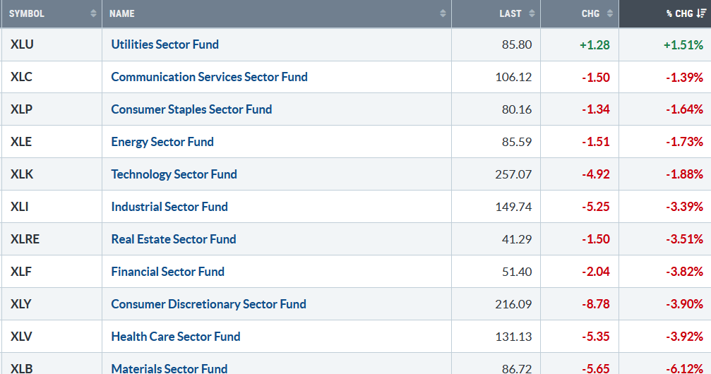
080125 weekly SPDR Sectors
Source: Stockcharts.com
Figure 2: Bonnie’s ETFs Watch List Performance Summary 07/25/25 – 8/1/25
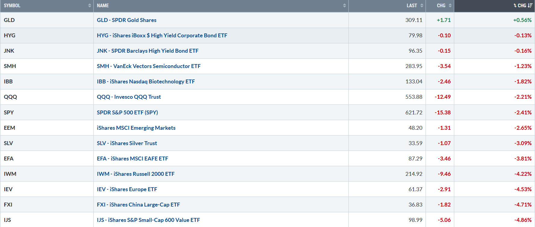
080125 Bonnie’s ETF Watch
Source: Stockcharts.com
Gold eked out a slight gain thanks to Friday’s rise. International markets were weak, including China, Europe, and Emerging Markets. Small Cap Growth and Small Cap Value were under heavy selling pressure, much weaker than the S&P 500.
Figure 3: UST 10YR Bond Yields Daily
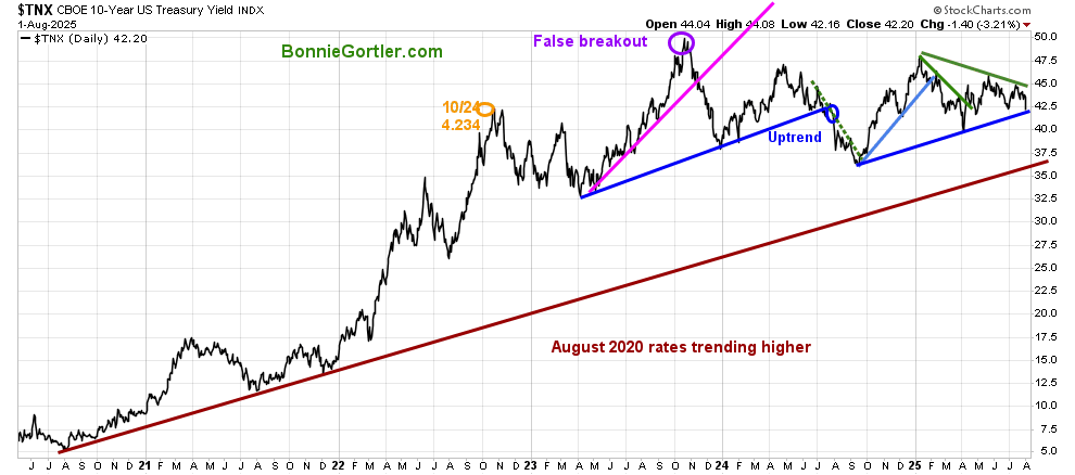
080125 10 Year US Treasury Yield
Source: Stockcharts.com
The 10-year U.S. Treasury dropped last week, closing at 4.220, as investors sold equities and bought Treasuries. If selling continues, its likely yields will decline further and break the August 2024 uptrend (blue line).
Learn how to implement a powerful wealth-building mindset and charting strategies to help you grow your wealth in the comfort of your home in my eCourse Wealth Through Investing Made Simple. Learn more here.
Figure 4: Fear & Greed Index
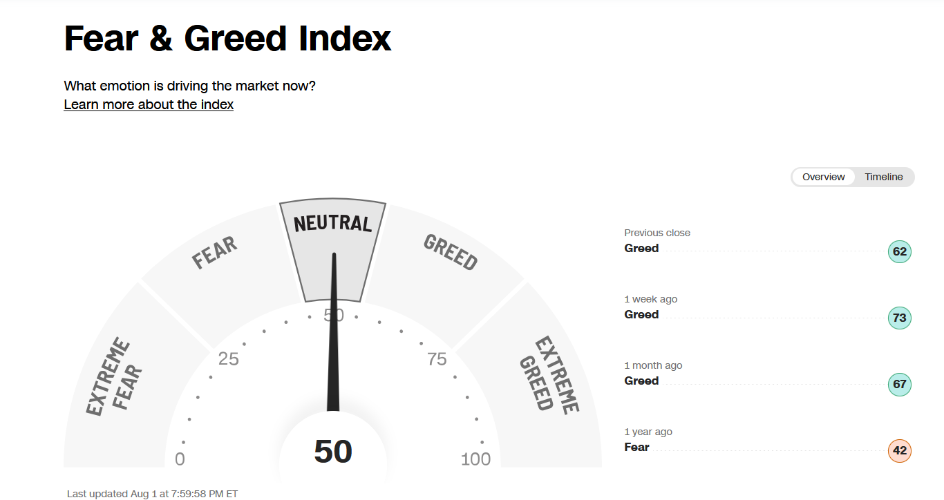
080125 CNN Fear and Greed Index
Source. CNN.com
Investor sentiment, as measured by the Fear and Greed Index (a contrarian indicator), fell sharply to 50 last week, indicating a shift to Neutral and no longer showing Greed.
Figure 5: NYSE New Lows
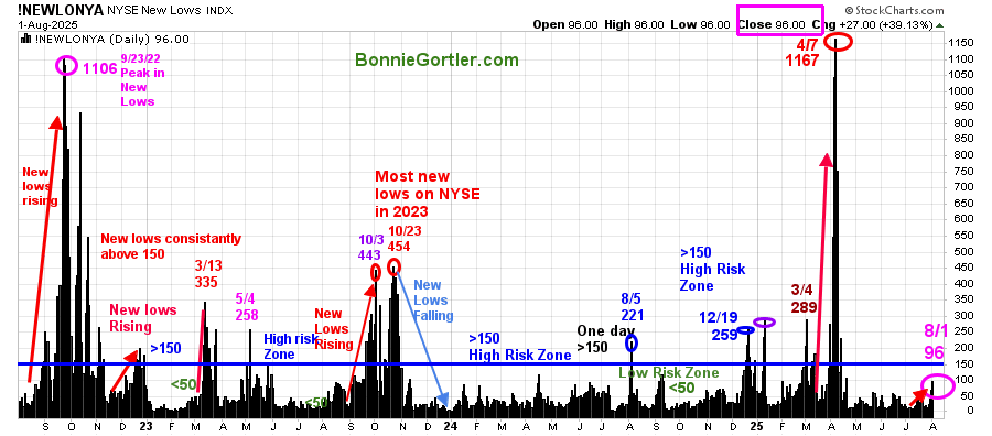
080125 NYSE New Lows
Source: Stockcharts.com
New Lows on the NYSE peaked at 1167 on 4/7/25, then contracted sharply as the market bottomed in April.
Last week, New Lows rose sharply from 15 (lowest risk) to close at 96 on Friday, indicating a warning of possible market weakness or a change in the tone of the market.
An increase above 150 would be negative. On the other hand, if the New Lows contract and falls between 25 and 50, it would be positive in the short term.
Learn more about the significance of New Lows in my book, Journey to Wealth, published on Amazon. For a chapter preview of Journey To Wealth, you can download a free chapter on my website here.
Figure 6: CBOE Volatility Index (VIX)
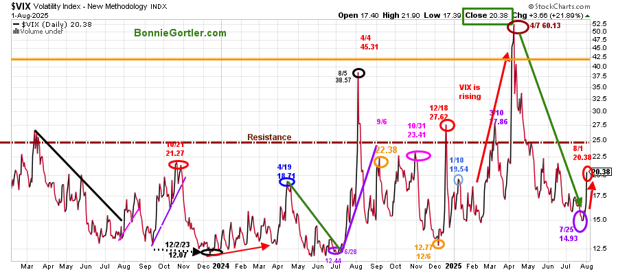
080125 VIX Daily
Source: Stockcharts.com
The CBOE Volatility Index (VIX), a measure of fear, broke its downward trend since its high made at the April bottom on last week’s sell-off. Historically, VIX tends to rise during the next several months.
The VIX rose 36.50% last week, closing at 20.38. A reading above 22.50 would be the first sign that intraday volatility is likely to increase.
Above 25.00 would likely imply that VIX continues to rise if investors become cautious, selling stocks and taking profits. VIX could jump between 32 and 40 quickly if the bears take control.
Figure 7: Value Line Arithmetic Average Weekly (Top) and 12-26-9 MACD (Bottom)
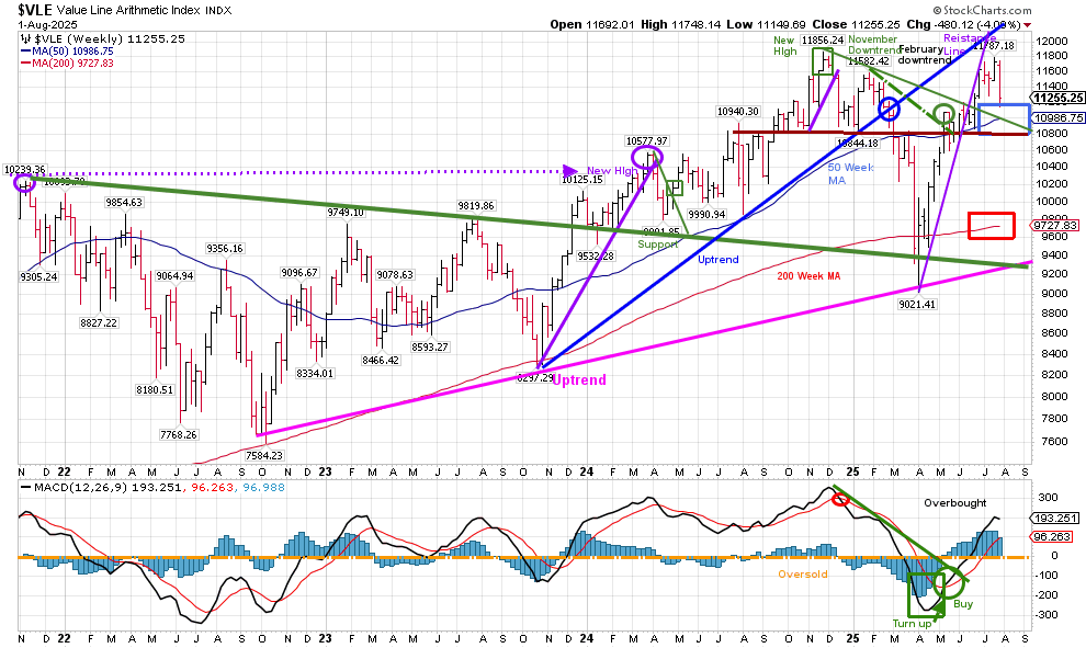
080125 VLE Weekly
Source: Stockcharts.com
The Value Line Arithmetic Index ($VLE) is a mix of approximately 1700 stocks.
VLE intermediate price trend from October 2022 remains in an uptrend (pink line). The VLE broke the April uptrend in May, but no significant downside pressure materialized, and the VLE rebounded. However, on the rise, there was no high made, confirming the highs made in the S&P 500 and Nasdaq.
Last week, VLE was under pressure, falling by -4.08%, closing at 11250 support. VLE continues to close above its 50-week moving average (blue rectangle) and 200-week moving average (red rectangle), a sign of strength.
Support is at 10800, 10400, 9700, and 9200. Resistance is at 11400, followed by 11800.
A weekly close above the old high at 11,856.24 would imply further gains ahead. On the other hand, short-term weakness with two closes below 11,250 would increase the odds of a correction towards 10800.
I invite you to join my Charting Facebook Group. Learn more about it here: Wealth Through Market Charts.
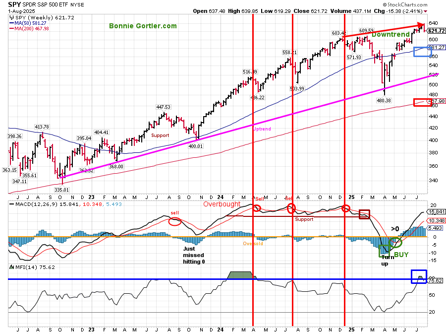
Figure 8: S&P 500 Weekly (SPY) and 12-26-9 MACD (Bottom) (Middle), and Money Flow (Bottom)
080125 SPY Weekly
Source: Stockcharts.com
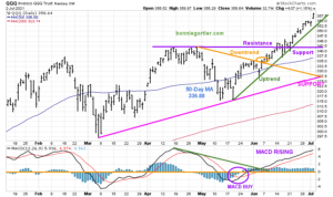
The S&P 500 (SPY) remains in an intermediate uptrend from October 2022. After hitting a low in April 2025, SPY consolidated its gains and then broke out of its channel, followed by making a new all-time high.
The MACD (middle chart) remains on a buy, above 0, no longer rising. It bears watching if MACD does not make a new momentum high with price and turns down. MACD can generate a sell signal if weakness continues.
The MFI Index turned down, closing at 75.62 after closing at 84.90, overbought, the previous week.
Summing Up:
After hitting the short-term projection of 635.00, the SPY pullback started last week.
The intermediate upside projection at 700.00 remains. However, a weekly close below 575.00 would negate the intermediate upside projection of 700.00.
Discover how to cultivate a powerful wealth-building mindset and effective charting strategies to grow your wealth from the comfort of your own home in my eCourse, Wealth Through Investing Made Simple. Learn more here.
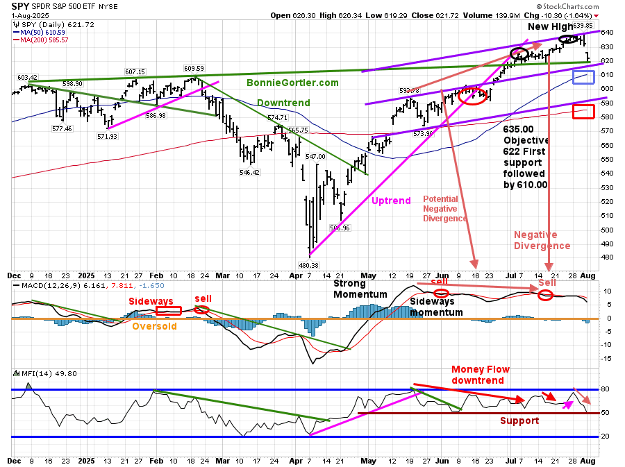
Figure 9: S&P 500 Daily (SPY) Price (Top), 12-26-9 MACD (Middle), and Money Flow (Bottom)
080125 SPY Daily
Source: Stockcharts.com
The upside objective of 635.00 for the SPY daily was hit on Friday, August 25.
The S&P 500 (SPY) fell -2.41% last week, testing the June breakout and 622.00 support. SPY remains above the 50 – and 200-day moving averages.
Support is at 612.00, 592.00, 585.00, and 575.00. Resistance is at 627.00, 635.00, and 639.00.
The MACD (middle chart) gave a repeat sell signal above 0, completing the bearish negative divergence (higher high in price with a lower high in MACD) in July. It appears the pullback has begun.
The Money Flow Index (lower chart) continued to hold the key 50 support level since April. A break below would be a short-term negative.
Summing Up:
With SPY short-term extended (daily chart) hitting its objective, and declining momentum and negative divergence, a pullback towards 575.00 to test the breakout of the intermediate SPY channel appears to be in process.
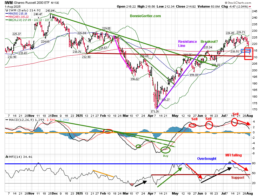
Figure 10: Daily iShares Russell 2000 (IWM) Price (Top),12-26-9 MACD (Middle), and Money Flow (Bottom)
080125 IWM Daily
Source: Stockcharts.com
IWM had broken the November 24 downtrend (green line) and appeared to have successfully tested the breakout. However, there was no significant follow-through to the upside, and the sellers reappeared.
The iShares Russell 2000 Index ETF (IWM) finished the week down -4.22%, underperforming the S&P 500 and closing below the 50-day moving average (blue rectangle) and the 200-day moving average (red rectangle), implying underlying weakness.
IWM short-term closed slightly above 214.00 with a low at 212.34 on Friday. Two closes below 214.00 would imply that the breakout failed and likely indicate continued weakness in the short term. Resistance is at 221.00 and 226.00.
The MACD (middle chart) remains on a sell signal, above 0, and falling with a bearish triple top formation, not yet in position to generate a fresh buy.
The Money Flow (lower chart) reached 80 earlier in May and July, indicating an overbought condition, and continues trending down, breaking below 50, which I view as negative.
In case you missed my interview live with Ryan Redfern, brought to you by the National Association of Active Investment Managers (NAAIM), you can view it here: https://www.youtube.com/watch?v=Y1nCBob4_1c
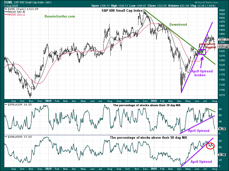
Figure 11: S&P 600 Small Cap Index and Percentage of stocks above the 20-day MA (middle chart) and 50-day MA (bottom chart)
080125 S&P 600 percentage stocks above 20 and 50 MA
Figure 11: S&P 600 Small Cap Index and Percentage of stocks above the 20-day MA (middle chart) and 50-day MA (bottom chart)
Source: Stockcharts.com
The S&P 600 Small Cap Index dropped -3.95% last week.
With the decline, internals continue to weaken. The percentage of stocks above the 20-day MA (middle chart) broke the April uptrend.
The percentage of stocks above the 50-day MA (bottom chart) dropped from 66.57 to 37.00 last week, remaining below the uptrend (purple line, red circle).
In Sum
The S&P 600 Small Cap Index (top chart) broke key support at 1352.00 (brown line) for the second day on Friday, indicating a short-term negative trend.
Figure 12: Daily Semiconductors (SMH) (Top), 12-26-9 MACD (Middle), and Money Flow (Bottom)
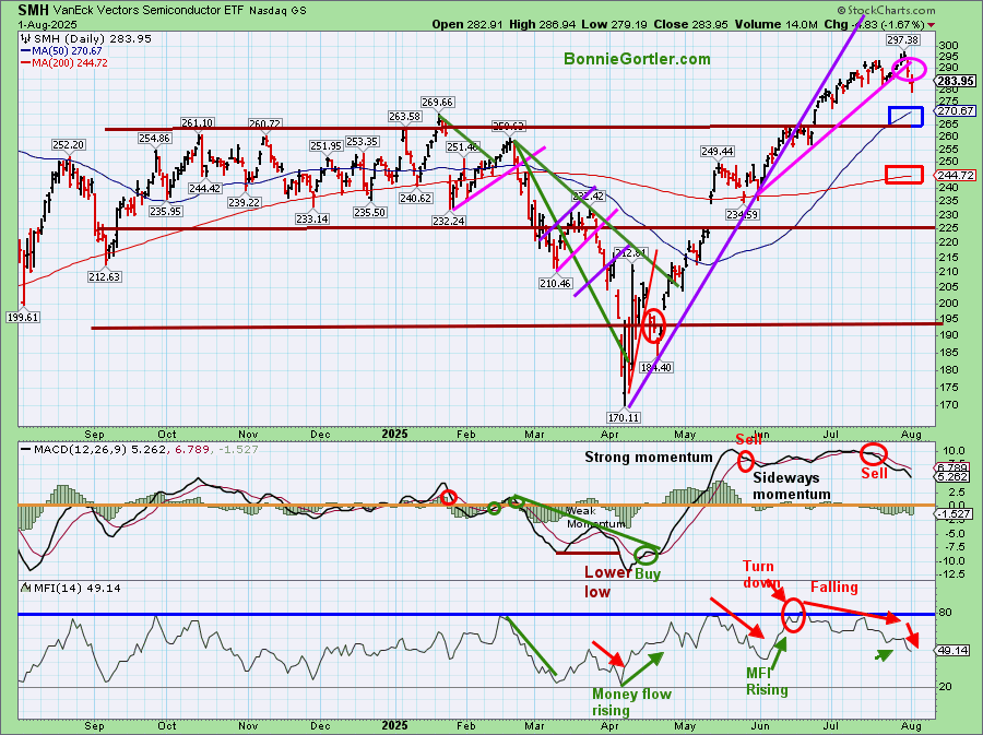
080125 SMH Daily
Source: Stockcharts.com
The top chart shows the Daily Semiconductor (SMH) ETF, which is concentrated mainly in US-based Mega-Cap Semiconductor companies. SMH tends to be a leading indicator for the market when investors are willing to take on increased risk, and the opposite is true when the market is falling.
SMH fell last week -1.23%, after -0.97% the week before, continuing to trade within a tight range and closing above the rising 50-day MA (blue rectangle) and the 200-day MA (red rectangle), indicating underlying strength. However, it’s negative; the June uptrend broke.
Support remains at 282.00, 272.00, 265.00, 256.00, and 243.00. Resistance remains at 290.00 with an upside objective of 315.00. Two closes below 265.00 would negate the upside objective.
The MACD (middle chart) remains on a sell signal. After sideways momentum above 0, and generating repeated sell signals, MACD is falling, suggesting that risk is on the rise.
The Money Flow (lower chart) has declined since June, after reaching above 80. Note that the intermediate chart of SMH (not shown) has also hit 80 and has fallen below.
SMH can be highly volatile. If there is leadership in Semiconductors (SMH), it would have a short-term positive impact. On the other hand, if SMH is weak and closes below 282.00, a pullback is likely to trigger stops and profit-taking.
Figure 13: VanEck Vectors Semiconductor/Invesco QQQ Trust (SMH/QQQ) Weekly Relative Strength Ratio
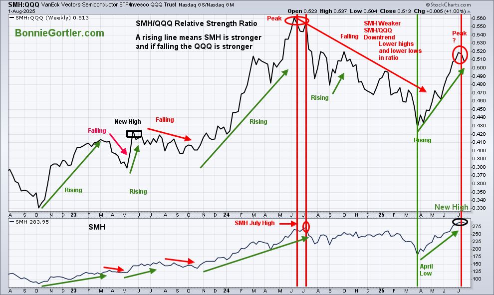
080125 SMH QQQ Relative strength ratio Weekly
Source: Stockcharts.com
The top part of the chart is the weekly VanEck Vectors Semiconductor/Invesco QQQ Trust (SMH/QQQ) Index Ratio. A rising line indicates the SMH is stronger, and if falling, the QQQ is stronger.
The SMH/QQQ ratio peaked in July and is now trending down. If this relationship continues, look for potential weakness in SMH, which could spread to the Technology Sector.
Learn more about Relative Strength Ratios in my eCourse, Wealth Through Investing Made Simple, and more here.
Figure 14: QQQ Daily Invesco QQQ Trust (QQQ) Price (Top), 12-26-9 MACD (Middle), and Money Flow (Bottom)
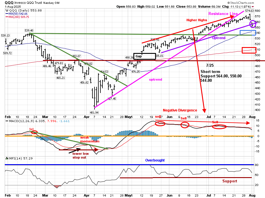
080125 QQQ Daily
Source: Stockcharts.com
The Chart shows the daily Invesco QQQ, an exchange-traded fund based on the Nasdaq 100 Index.
Nasdaq 100 (QQQ) fell -2.21% last week, breaking the May uptrend ( purple line) and support at 564.00 as mentioned in the 7/25 market update. However, its positive QQQ remains above the 50-day MA (blue rectangle) and the 200-day MA (red rectangle), and the April uptrend remains in effect.
Support is at 550.00, 544.00, 534.00, and 510.00. Resistance is at 564.00 and 568.00. QQQ upside objective is 580.00. Two closes below 544.00 will negate my upside objective.
The daily MACD remains on a sell signal above 0, with repeat sell signals and a negative divergence, suggesting that risk is on the rise.
Summing Up:
Last week, there was broad weakness in the major averages. Market breadth, momentum, and volume patterns weakened. Short-term indicators that had flashed warning signals are not yet favorable, and patience is needed to see if the decline last week will break support levels below and begin to accelerate. August, September, and October could be volatile months. Take a moment to evaluate your portfolio and ensure you’re not taking on more risk than fits your lifestyle. Manage your risk, and your wealth will grow.
If you would like to get to know each other better and grow your wealth, schedule your Wealth Building Free 30-minute Strategy Session today. Register Here.


Create more wealth in your life
with these simple strategies.
As an added bonus you will also
receive BG’s Updates and Ezine

Discover how to quickly create more well-being in your life with these simple strategies.
As an added bonus you will also
receive BG’s Updates and Ezine

As an added bonus you will receive BG’s Updates and Ezine

All work listed on BonnieGortler.com is licensed under a Creative Commons Attribution - Noncommercial - No Derivative Works 3.0 Unported License.
