
10 Simple Tips for Financial Well-Being
07/01/2026
A sharp reversal to the upside, resulting in the best gains in a week this year. Ten of the eleven sectors rose, four stronger than the SPDR S&P 500 ETF Trust (SPY) up +6.15%, Consumer Discretionary (XLY), and Technology (XLK) were the best performing sectors, while Utilities (XLU) and Energy (XLE) were the weakest.
3/11/22 – 3/18/22
S&P SPDR Sector ETFs Performance Summary
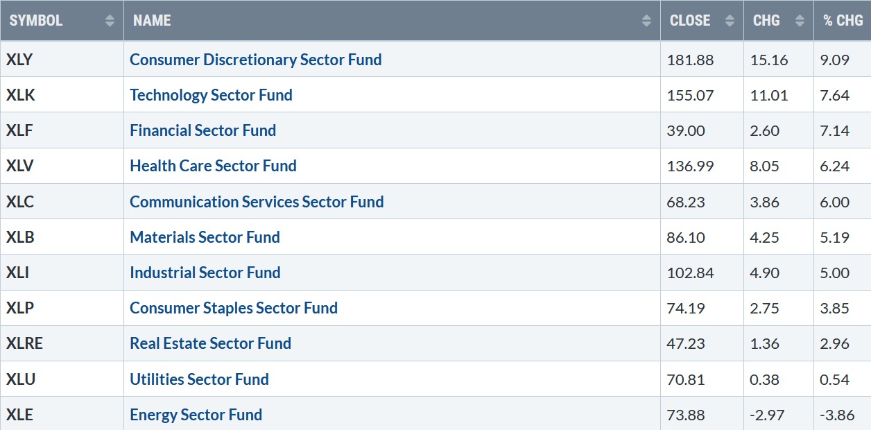
031822 SPDR Sectors
Source: Stockcharts.com
Figure 2: Bonnie’s Mix of ETFs To Monitor
Performance Summary 3/11/22 – 3/18/22
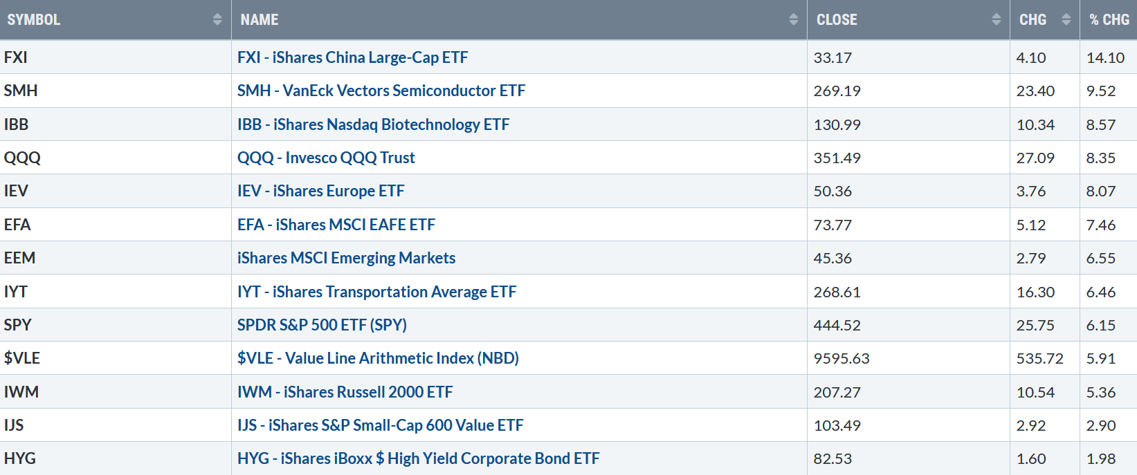
031822 Week ETFs
Source: Stockcharts.com
A broad market rally with both U.S. and global markets rising sharply. China led, followed by Semiconductors, Biotechnology, and Technology stocks as investors scooped up bargains buying riskier assets.
Figure 3: UST 10YR Bond Yields Daily
31822 UST 10YR Bond Yields Daily
Source: Stockcharts.com
The 10-Year U.S. Treasury yields rose last week, closing at 2.148% near the highs for the year. The upside objective remains at 2.7%, while the 5 Year U.S Treasury yields rose, closing at 2.14%.
Selling pressure vanished as the buyers stepped in. The Down was up five straight days, and the S&P 500 and Nasdaq up four days in a row. For the week, the Dow gained +5.50%, S&P 500 up +6.16%, while Nasdaq gained +8.18%, the strongest of the major averages. The Russell 2000 Index rose +5.38 %, and the Value Line Arithmetic Index (a mix of approximately 1700 stocks gained +5.91%. It was a deserved change, watching a green screen instead of a sea of red each day.
The Dow, S&P 500, and Nasdaq had their most significant weekly gains since November 2020. Weekly market breadth was positive but not impressive based on the size of the week’s gains. The New York Stock Exchange Index (NYSE) had 2540 advances and 1025 declines with 114 new highs and 939 new lows. Nasdaq had 3721 advances and 1497 declines and 161 new highs, and 1306 new lows.
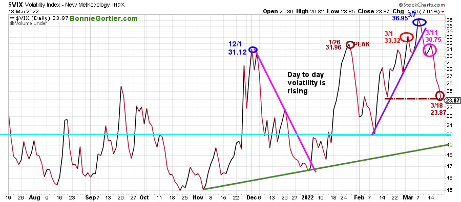
Figure 4: CBOE Volatility Index VIX
31822 DAILY VIX
Source: Stockcharts.com
The CBOE Volatility Index ($VIX), a measure of fear, remains above average in 2022.
VIX previously made a high at 31.96 on 1/26 (brown circle), on 3/1 at 33.32 (red circle), and 36.95 on 3/7 (blue circle).
On 3/11, 30.75 (pink circle), VIX did not make a new high despite the decline in the major averages, which turned out a clue a rally could occur. Last week VIX dropped sharply toward the level mentioned in the 3/11/22 market update, closing on 3/18 at 23.87 (brown circle), an indication for the rally to continue if VIX remains below 24.00 and then gets below 20.00.
On the other hand, if VIX starts to climb early in the week and then closes above 28.00, the market stalls, and day-to-day volatility will increase.
Figure 5: Daily New York Stock Exchange (NYSE) New Lows
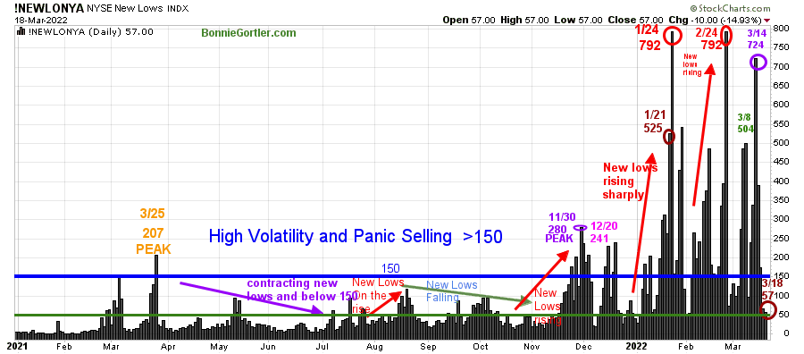
31822 Daily NYSE NEW LOWS
Source: Stockcharts.com
Watching New lows on the New York Stock Exchange is a simple technical tool that helps awareness about the immediate trend’s direction.
New lows warned of a potential sharp pullback, high volatility, and “panic selling” for most of 2022, closing above 150. Learn more about the significance of New Lows in my book, Journey to Wealth, published on Amazon. Here is an excerpt, when new lows are above 150, the market is negative, higher risk, selling is taking place. Sometimes it could be severe, and sometimes on a very nasty day, you can have “panic selling,” and big wild swings (high volatility) to the downside may occur.
As the market sold off in January, New Lows rose sharply, peaking at 792 on 1/24 (red circle) and then contracted but not enough to be in a low-risk zone before rising again on 2/24 at 792, matching the 1/24 peak. On 3/14, it was a positive sign new lows stayed below January and February’s readings.
For the first time since 3/2, there were more new highs on the NYSE than lows on Friday. This week monitor New Highs, too. If they expand, this would be bullish.
New Lows finished the week at 57 (brown circle), below 150 for the second day in a row. It would be encouraging if News Lows falls between 25 and 50, indicating lower risk and a sign that the rally is sustainable in the short-term. But, on the other hand, we don’t want to see New Lows rise above 150, then I would expect the rally to stall.
Figure 6: Nasdaq New Lows
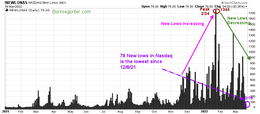
31822 Daily NASDAQ NEW LOWS
Source: Stockcharts.com
Nasdaq New Lows peaked in February at 1344, but New Lows decreased as the Nasdaq Index fell in 2022. Last week new lows in Nasdaq were the lowest since 12/8/21. If this trend continues, more gains are likely in the Nasdaq.
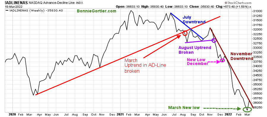
Figure 7: Daily Nasdaq Advance-Decline Line

31822 Nasdaq Daily AD Line
Source: Stockcharts.com
The daily Nasdaq advance-decline line remains in a downtrend in 2022 after peaking in February 2021 (brown circle), followed by failed attempts to make a new high.
After breaking the October uptrend (blue dotted line), the Nasdaq AD-Line made a series of lower highs and lower lows in November, December, and January.
Two clear-down trends (blue and purple) remain in effect.
A double bottom pattern potentially making a higher low similar to March 2020 (green rectangle) was developing but didn’t materialize. However, a potential V bottom identical to December 2019 (purple rectangle) is now possible and appears ready to break the November downtrend (blue line), which would be bullish in the near term.
Figure 8: Weekly Nasdaq Advance-Decline Line
31822 Nasdaq Weekly AD Line
Source: Stockcharts.com
After breaking down in August last year, the Nasdaq Weekly AD-Line made a few attempts to form a bottom but failed, continuing to make lower lows In January, February, and early March.
Rallies have been weak until last week’s Nasdaq’s rise of 8.18%. The November downtrend remains. However, it appears on the verge of being broken, which implies the worst of the decline is likely over.
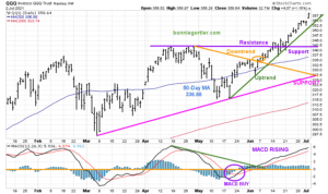
Figure 9: Daily iShares Russell 2000 (IWM) Price (Top) and 12-26-9 MACD (Middle) and Money Flow (Bottom)
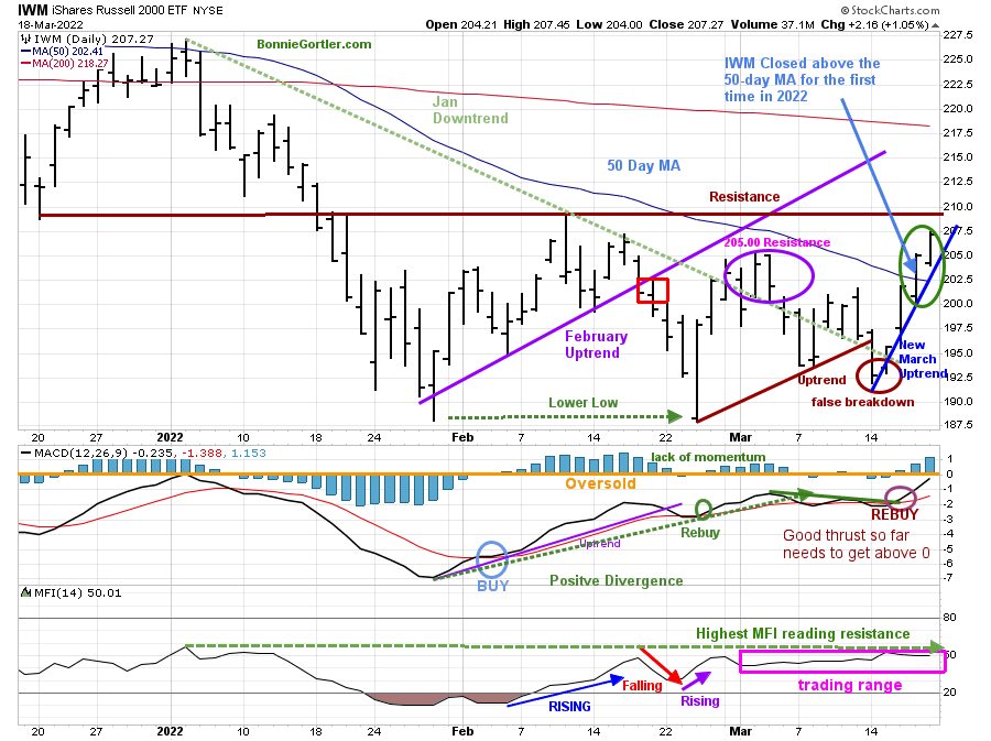
31822 DAILY IWM
Source: Stockcharts.com
The top portion of the chart is the daily iShares Russell 2000 Index ETF (IWM), the benchmark for small-cap stocks, with a 50-Day Moving Average (MA) (blue line) and 200-Day Moving Average (MA), that traders watch and use to define trends. A false breakout occurred in November 2021 in IWM after being in a nine-month trading range.
The February uptrend and support at 200.00 was penetrated on 2/18 (red rectangle) and remained below its 50 and 200-Day Moving Average. In March, IWM failed to close over resistance at 205.00 and turned lower, a false breakout of the 2022 downtrend (green dotted line).
The short-term trend shifted to up last week (blue line). IWM rose +5.36% for the week closing at 207.27, above the first resistance of 205.00, breaking the downtrend (green dotted line).
IWM closed above the 50-Day MA for the first time in 2022 (blue arrow).
Short-term resistance is 207.50 and 210.00. Support is at 205.00 and 202.50.
MACD (middle chart) has not shown much upside momentum in 2022, failing to get above 0. However, MACD’s latest rebuy shows a favorable initial thrust. It would be positive if MACD could reach above 0 for the first time in 2022, signaling underlying strength. On the other hand, a turn down now would be negative.
Since February, Money Flow (lower chart) has whipsawed in a trading range with only slight upticks. This pattern remains. For the IWM to accelerate, money flow needs to get over resistance, making a new high for the year (green dotted line).
IWM looks the best it has in 2022. However, to confirm the rally is sustainable, IWM needs to close above 210.00, MACD gets above 0, and Money flow rises, breaking out of the trading range to a new high.
The intermediate Term Remains Down: No Momentum Confirmation Yet
Figure 10: Weekly iShares Russell 2000 (IWM) Price (Top) and 12-26-9 MACD (Bottom)
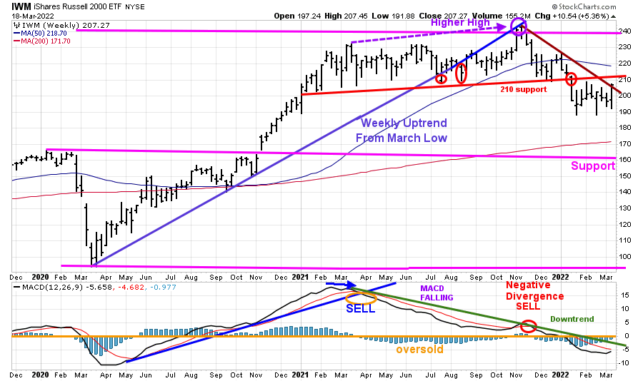
31822 Weekly IWM
Source: Stockcharts.com
The Russell 2000 (IWM) (top chart) closed below the March uptrend (blue line) in July 2021, but no significant decline followed. A consolidation began, followed by a new high in November 2021. Since then, IWM has been in a downtrend.
Resistance is 210.00, previous old support.
MACD (lower chart) is on a sell, oversold, below 0 but is now rising and is close to generating a buy. The downtrend (green line) in MACD from February 2021 remains. If and when broken, it will confirm the next leg up for small caps.
Figure 11: Daily Invesco QQQ Trust (QQQ) Price (Top), and 12-26-9 MACD (Bottom)
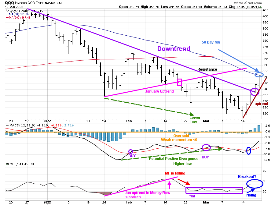
31822 QQQ Daily
Source: Stockcharts.com
The chart shows the daily Invesco QQQ, an exchange-traded fund based on the Nasdaq 100 Index with its 50-Day Moving Average and 200-Day Moving Average. QQQ accelerated after breaking the January uptrend (pink rectangle), penetrating the January lows and falling through the first downside objective at 330.00, not reaching the lower objective of 310.00 before reversing higher. QQQ stalled at 351.00 resistance in early March and turned lower.
Last week QQQ had an explosive week to the upside, closing at 351.49, up +8.35%, getting through two levels of resistance 340.00 and 351.00, closing only slightly below its 50- Day MA.
Resistance is at 355.00 and 370.00. Support is at 340.00, and a close below 340.00 would break the short-term uptrend (brown line).
The lower chart is MACD (12, 26, 9), a measure of momentum. MACD is on a buy, rising at its highest level in 2022 but below 0. It would be bullish if MACD continues to rise and gets above 0.
Money Flow is rising but remains in a sideways trading range.
A close above 355.00 will be a clue there is more short-term upside without a pullback.
Intermediate-Term Trend Turns Up Unconfirmed by MACD
Figure 12: Weekly Invesco QQQ Trust (QQQ) Price (Top) and 12-26-9 MACD (Bottom)
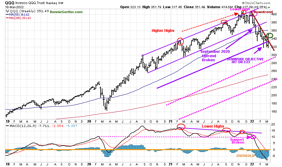
Source: Stockcharts.com
The top chart shows the weekly Invesco QQQ Trust (QQQ) making higher highs peaking in November 2021 (red circles) but failed to make a new high in December 2021 and then turned hitting it 325.00 downside objective on 2/22.
MACD (lower chart) remains on a sell after making lower highs and breaking below support held since February 2020 (pink dotted line), implying weak underlying momentum. MACD remains deeply oversold, below 0, lower than March 2020 low.
QQQ rose, MACD flattened but has not confirmed a shift in the intermediate trend, which remains down.
Downside objectives remain at 285.00, followed by 235.00.
Figure 13: Van Eck Semiconductors (SMH) Daily Price (Top), 12-26-9 MACD (Middle) and, Money Flow (Bottom)
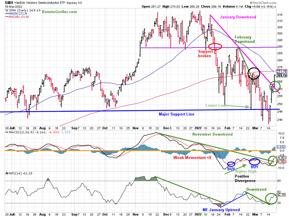
31822 SMH Daily
Source: Stockcharts.com
Support was broken (red circle) in late January, and SMH fell sharply but held the October 2021 lows. SMH then rallied but turned down again, closing below support at 240.00 on 3/14/22, a false breakdown.
SMH rose sharply, closing at 260.19 up +9.52%, as the investors stepped in to buy stocks at bargain prices. SMH broke the January downtrend (pink line) and is only slightly under the 50 and 200 day Moving Average.
Support is at 255.00, followed by 240.00. Resistance is at 275.00 and 290.00.
MACD (middle chart) is on a buy (green circle), and it broke the November downtrend (green line), confirming the reentry.
Money Flow (lower chart) had a few turn-ups without upside momentum early in March. However, a different picture now. The downtrend (green line) in Money Flow broke last week, implying that investors are buying and confirming the breakout in MACD. Further gains are likely for SMH, which is bullish for the broad market.
Figure 14: Daily ARK Innovation (ARKK)
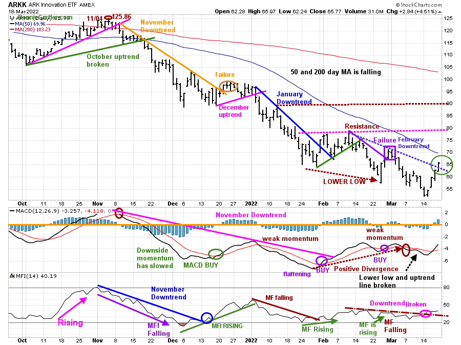
31822 ARKK Daily
Source: Stockcharts.com
ARK Innovation (ARKK) is an actively managed ETF by Cathie Wood that seeks long-term growth and is highly volatile. ARKK broke its September short-term downtrend (brown line) in October 2021.
Downside momentum temporarily subsided where ARKK broke its February downtrend (purple line), failing to close above resistance (pink dotted line). Afterward, rally attempts failed, and ARKK made lower lows creating a new downtrend (blue dotted line).
ARKK reversed sharply with an explosive rally last week, closing at 65.77, up 18.33% breaking the February downtrend. Resistance is 70.00, 72.50, and 80.00 Support is at 63.00, 57.00, followed by 62.00.
MACD failed to get above 0 since November 2021, implying internal weakness; MACD repeat buys have been early.
Money flow (lower chart) broke February’s downtrend (brown dotted line), confirming MACD.
ARKK remains high-risk and volatile. It’s positive the February downtrend is broken, and MACD and Money flow have confirmed the rise. However, the intermediate trend remains in a downtrend. With its high volatility, know that 10% swings in both directions can occur at any time.
Hi Yield Bonds Rise Supporting U.S. Equities
Figure 15: I Shares Hi Yield Corporate Bond (HYG)
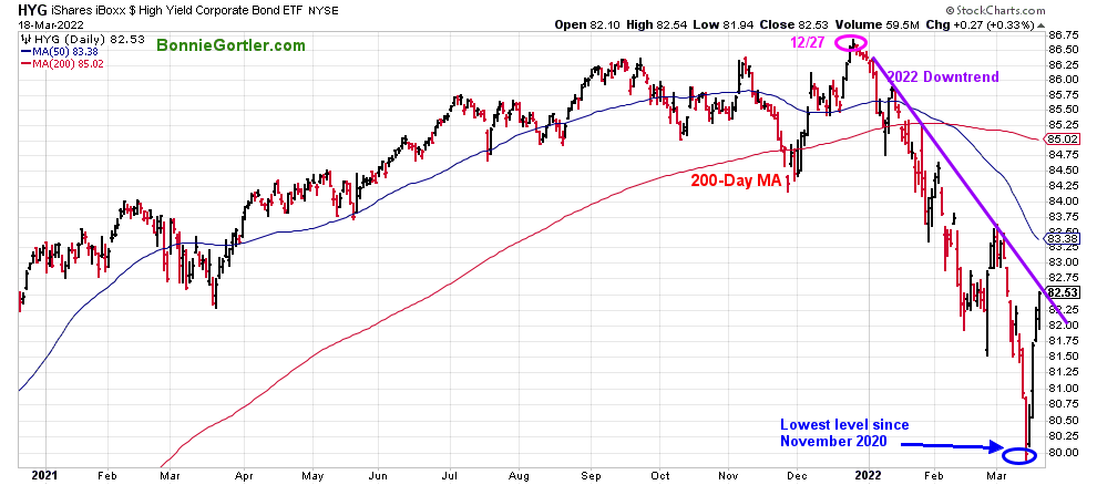
31822 HYG Daily
Hi-Yield Bonds (HYG) peaked on 12/27/21, appeared to stabilize in late February, but reversed lower, reaching their lowest level since November 2020 (blue circle).
HYG reversed sharply off of its low last week, up 1.98%. It would be positive if HYG breaks the downtrend and continues to rise, closing above its 50-Day MA at 83.38. Monitor the performance of HYG. Further gains would be positive, but a decline now would not be favorable for U.S. Equities.
Figure 16 ETFs: SPY, QQQ, IWM, and DIA with MACD (Middle) and Moneyflow (Bottom)
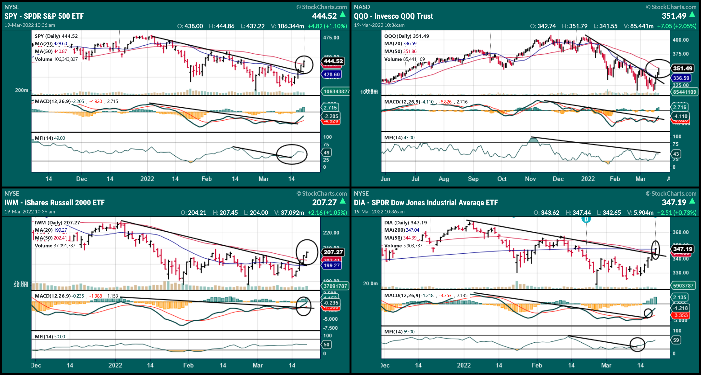
031822 SPY, QQQ, IWM, and DIA
Source: Stockcharts.com
Exchange-Traded Funds (ETFs): SPY, QQQ, IWM, and DIA broke their 2022 downtrends shifting the short-term trend to up.
MACD has confirmed the breakout in SPY, IWM, and DIA. QQQ is close and likely will follow.
Its positive Money Flow of SPY and DIA broke their downtrend, and IWM and QQQ have not yet but are likely to follow.
Its bullish the rally was broad; the best moves are the ones that go straight up or only a 1-2% pullback.
Summing Up:
The major averages had their largest weekly gains since November 2020, breaking downtrend, an impressive rally. Fear remains high, although no longer extreme. The short-term trend shifted to up last week, but the intermediate-term remains down; no confirmation yet, but momentum patterns are no longer falling and have stabilized. Watch for strength in market breadth, Small Caps, Technology, and Semiconductors to lead the market higher or, if they stall, unable to get through overhead resistance.
Remember to manage your risk, and your wealth will grow.
If you liked this article, you will love my Free Grow and Sustain Your Wealth Report. Get it here:
See more charts. I invite you to my FB group Wealth Through Market Charts.
I would love to hear from you. If you have any questions or comments or would like to talk about the market, click here.
Disclaimer: Although the information is made with a sincere effort for accuracy, it is not guaranteed that the information provided is a statement of fact. Nor can we guarantee the results of following any of the recommendations made herein. Readers are encouraged to meet with their own advisors to consider the suitability of investments for their own particular situations and for determination of their own risk levels. Past performance does not guarantee any future results.


Create more wealth in your life
with these simple strategies.
As an added bonus you will also
receive BG’s Updates and Ezine

Discover how to quickly create more well-being in your life with these simple strategies.
As an added bonus you will also
receive BG’s Updates and Ezine

As an added bonus you will receive BG’s Updates and Ezine

All work listed on BonnieGortler.com is licensed under a Creative Commons Attribution - Noncommercial - No Derivative Works 3.0 Unported License.


Free Report:
Grow and Sustain Your Wealth
Discover how to grow your money with these easy, simple steps.

